Scan to order
End-to-end product design project case study
The brief
We wanted to build a new product module for Atlas that will:
- Be the differentiator in the market
- Be the flagship "delightful" product of Atlas
Thats pretty vague. Right? Yes! So I decided to study the existing workflows and pain points.
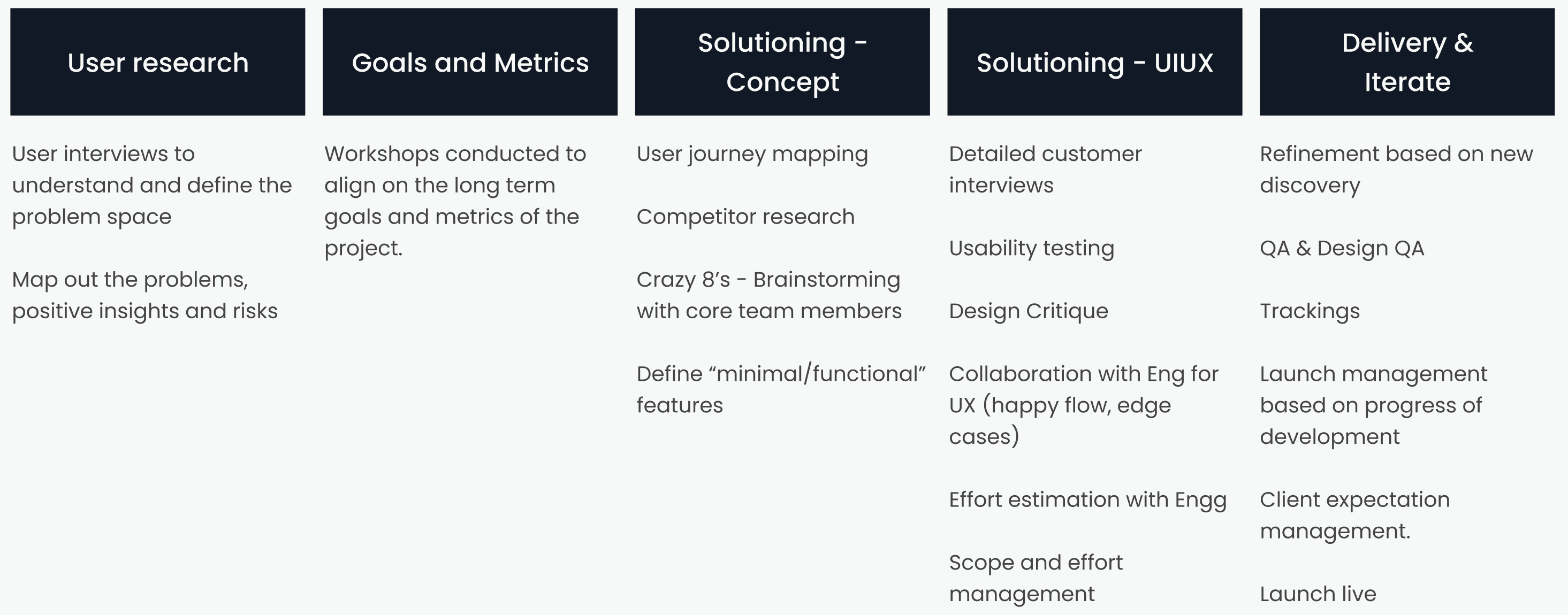
Problem discovery
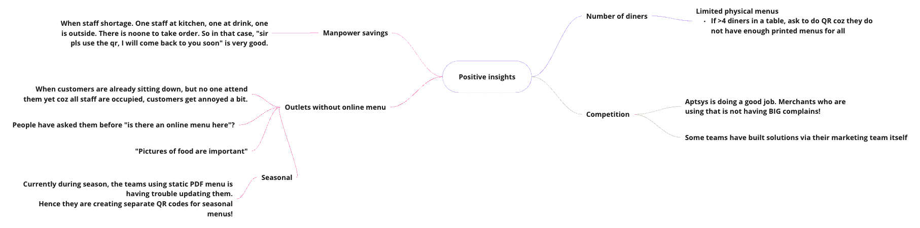
To kick off the project, I conducted user research by interviewing seven outlet managers from different restaurants in Singapore. The goal was to understand the current challenges faced with their existing QR ordering solutions.
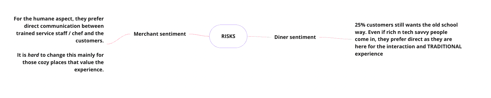
Through these interviews, I gained valuable insights into the pain points and limitations of the current systems. I documented the research findings, identifying both positive aspects and potential risks associated with implementing new solutions.
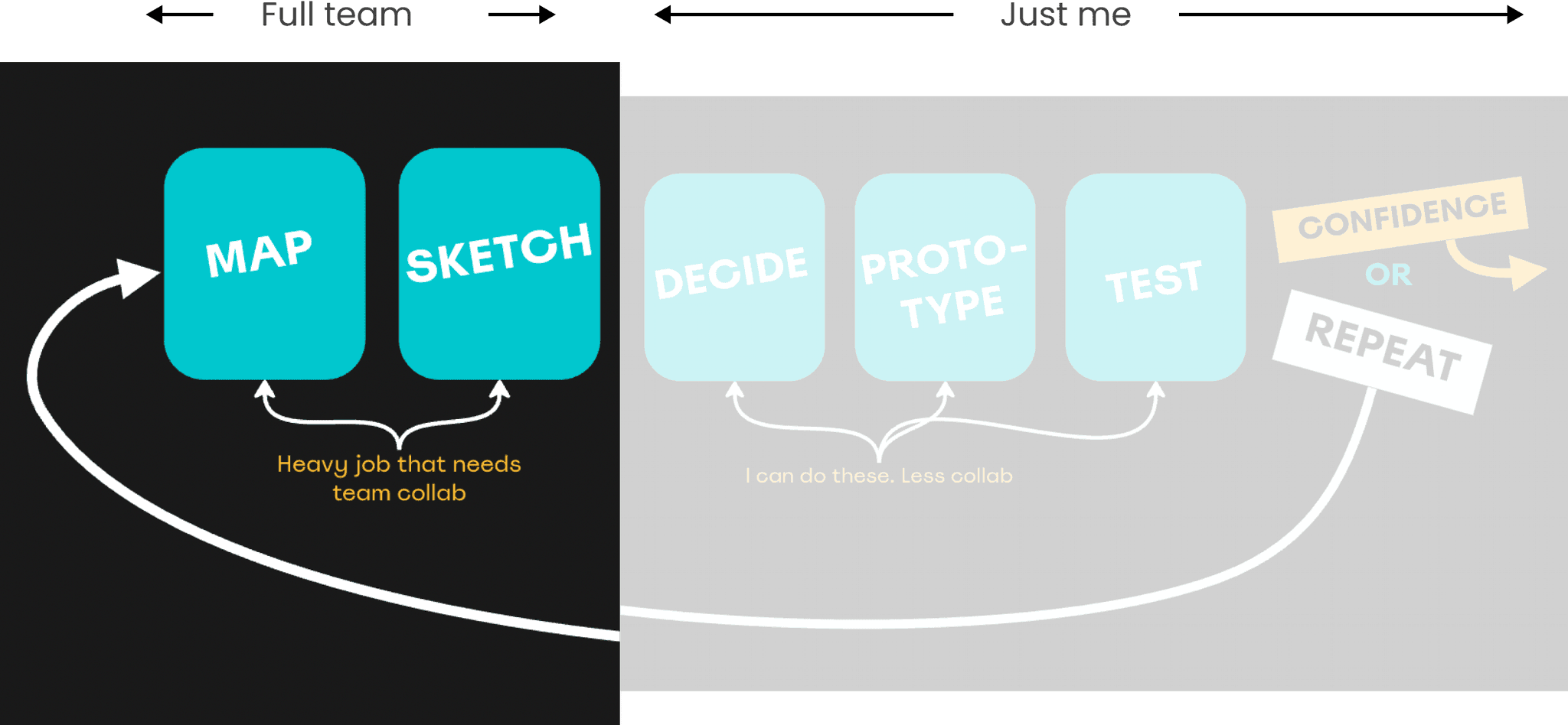
Design sprint time!!
A 5-day design sprint would be a luxury and a big ask from the entire team. So I cut the steps down into a 2-day design sprint — putting everyone's time only on the most important part.
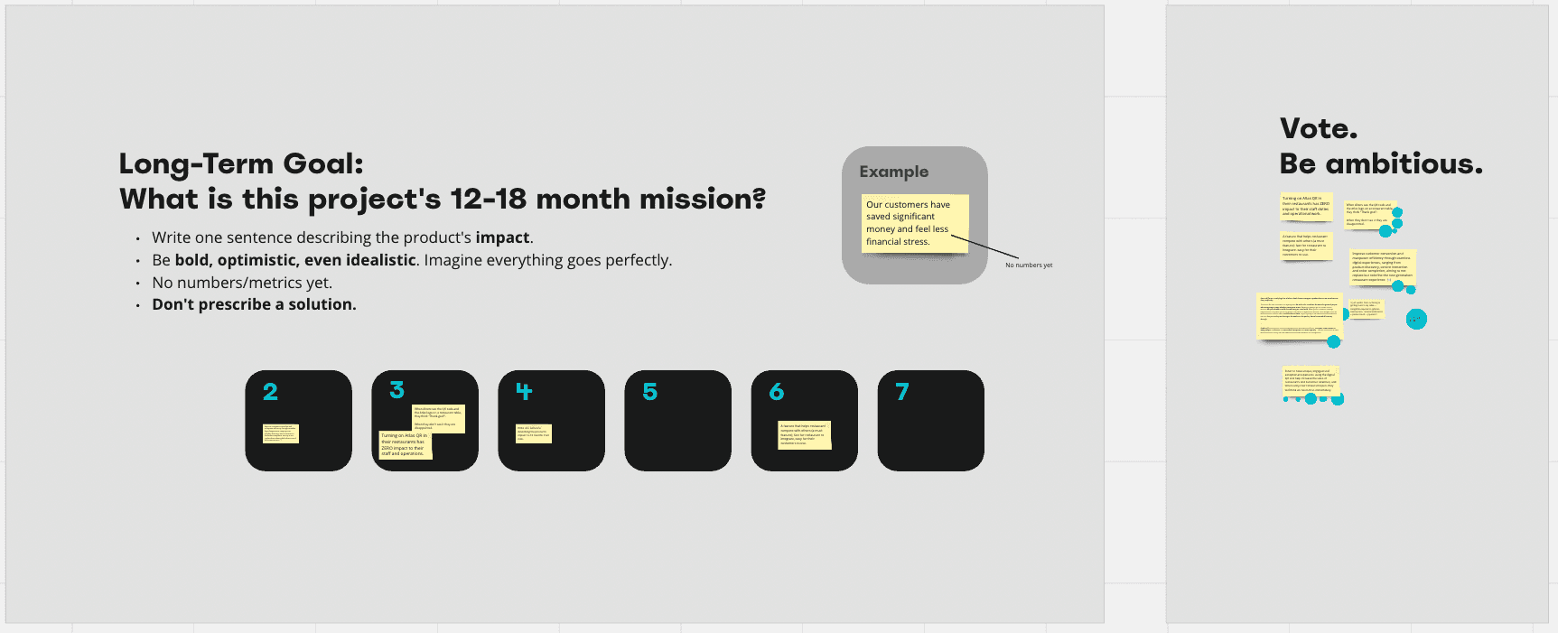
Defining the long-term goal
A collaboration session with the team to define the long-term goal for the product and business. We discussed and refined the project's metrics and goals, using sticky notes on Miro board to map out and vote on the preferred direction. This exercise helped align the team's vision and set a clear path for the project.
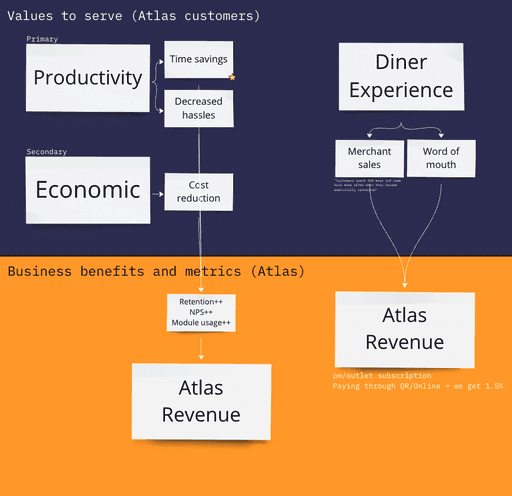
For guiding the team towards the right values, I prepared a value metric and how it relates to the business benefits. The flowchart explains how we should focus on values such as productivity, cost reduction, and diner experience to drive the metrics we care about.
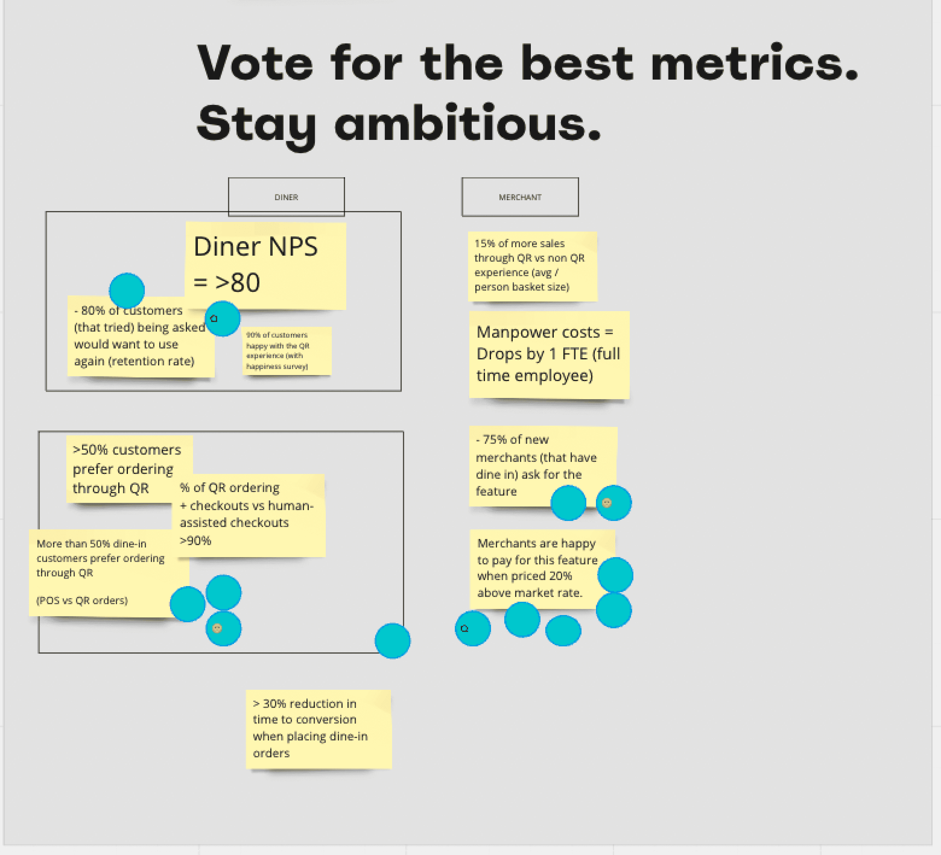
The metrics we chose
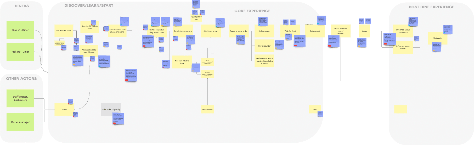
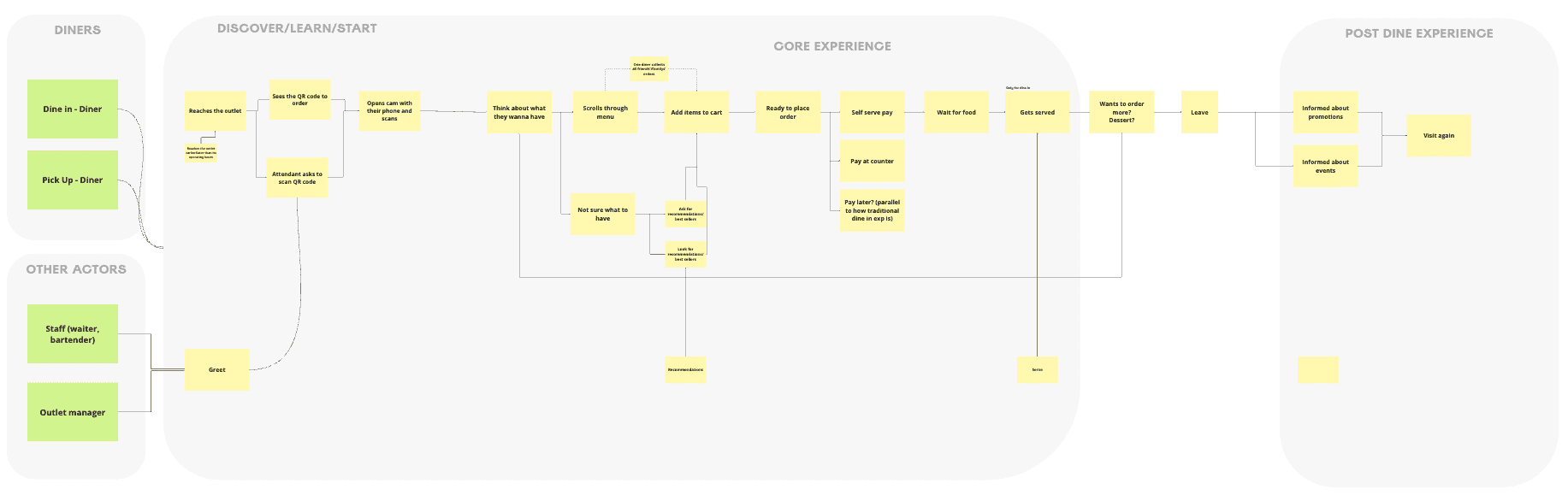
User journey map
A user journey of a typical scan-to-order + restaurant experience — from both the diner and outlet staff perspective — created by me based on the learnings from interviews (and experience as a diner myself). This map served as a visual representation of the entire ordering process for the activities to come.
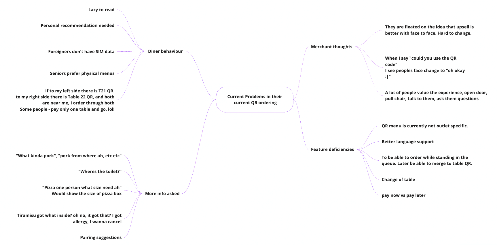
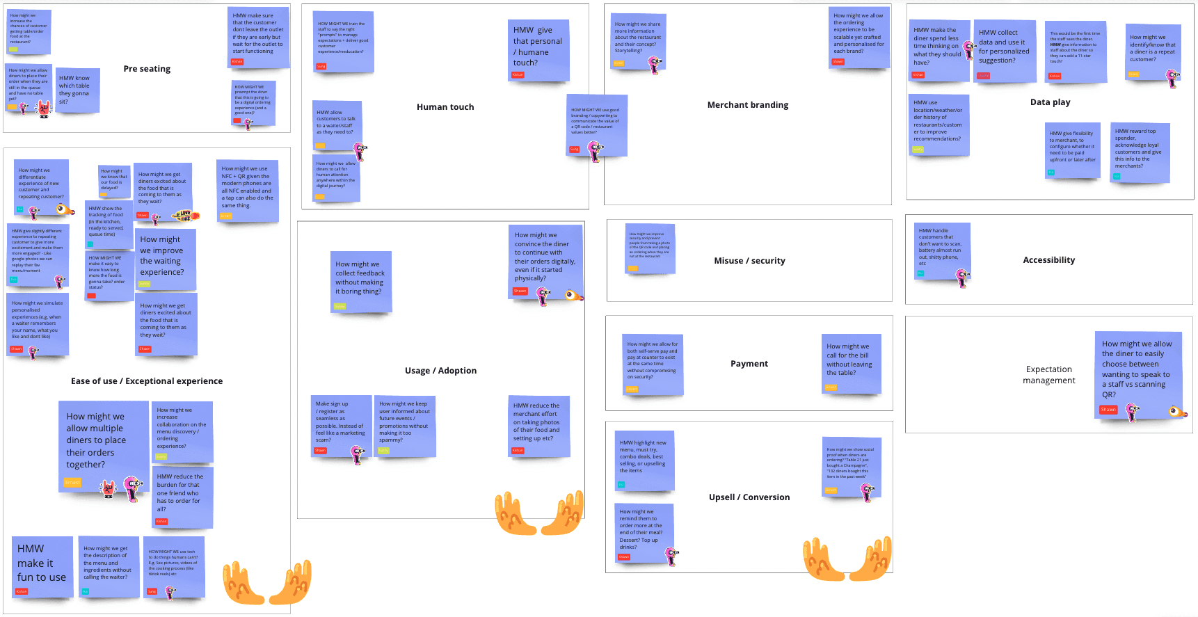
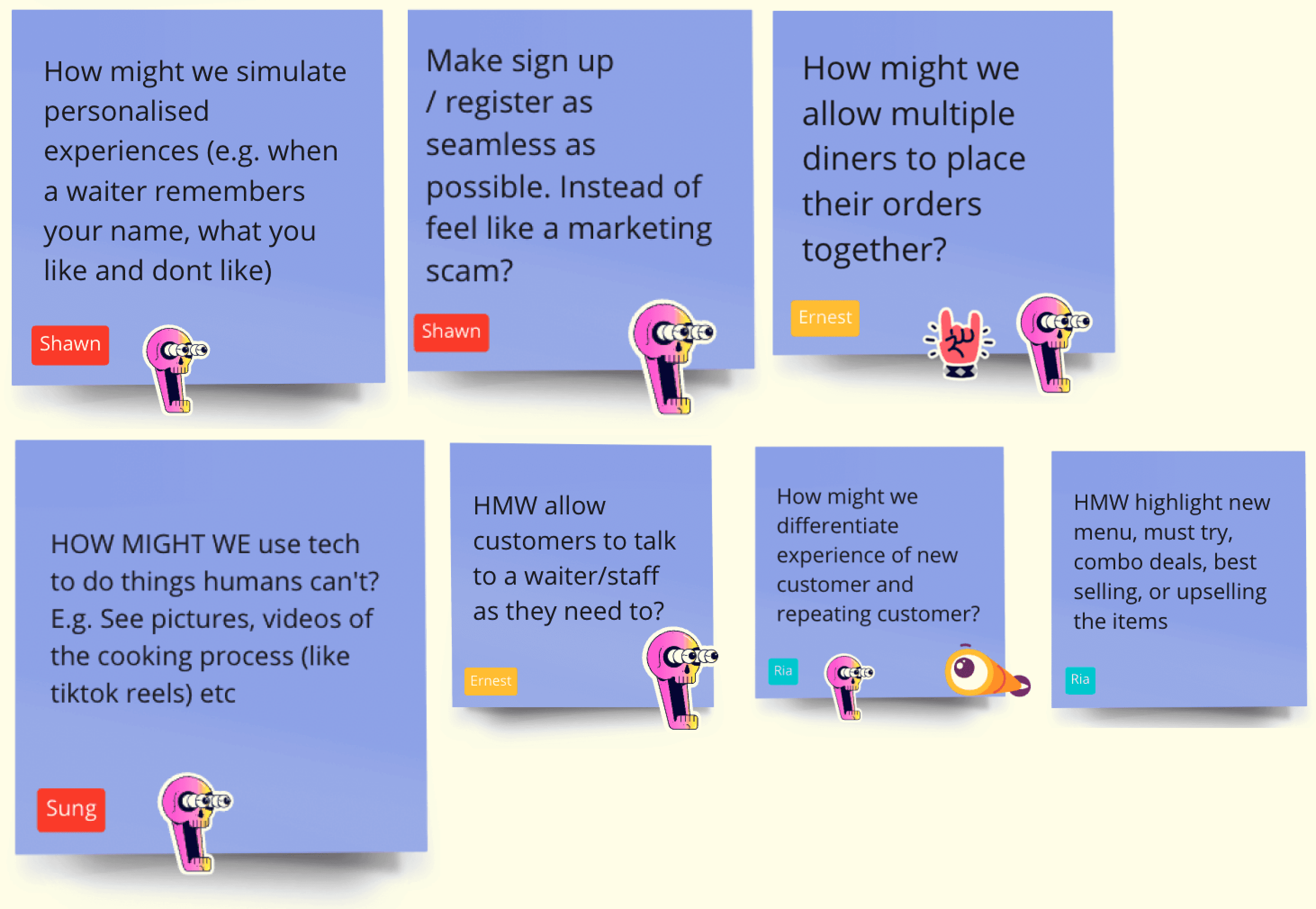
Generating HMWs
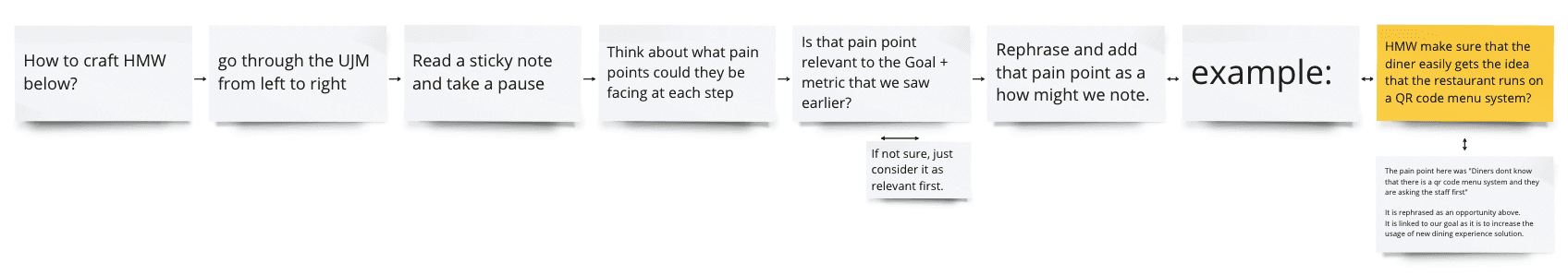
I used this diagram to educate (or refresh) the team on how to generate relevant HMWs. The team added How Might Wes (violet sticky notes) onto the user journey map to identify specific problem areas to generate potential solutions.
There were too many HMWs from various perspectives. Being a small startup, we couldn't solve all at once. We needed to identify the most impactful ones for business, with haste. So I organised a card sorting exercise to group the HMWs into categories. This ensured: focus on key categories, everyone aware of each, and lightning-fast prioritisation.
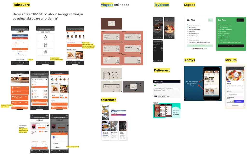
Competitor research
A simple competitor research was done on the products available in the market to aid with the brainstorming — and partially to make sure we'd be a differentiator in the market.
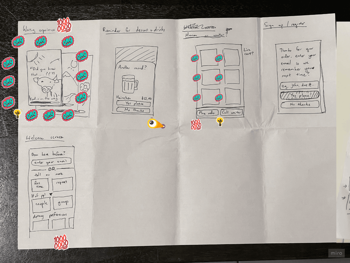
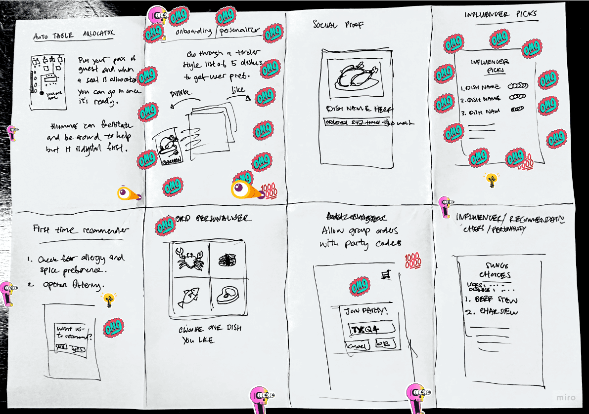
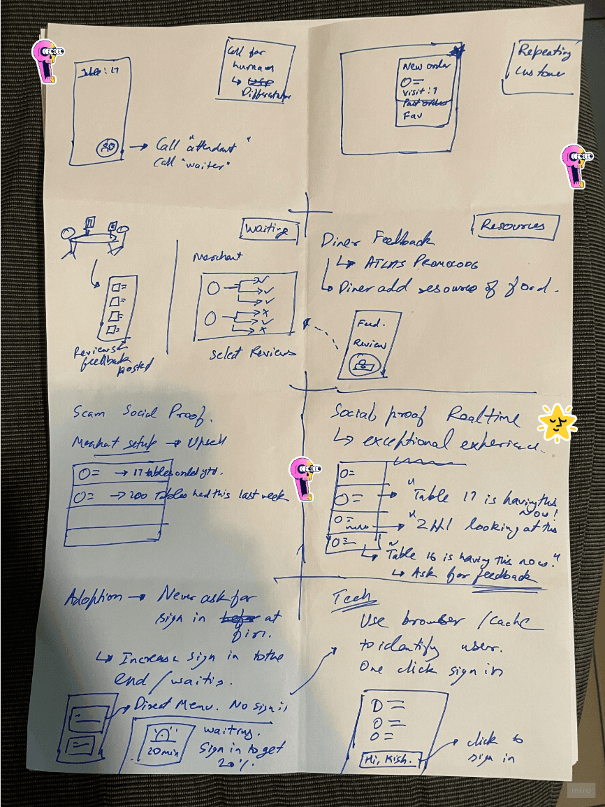
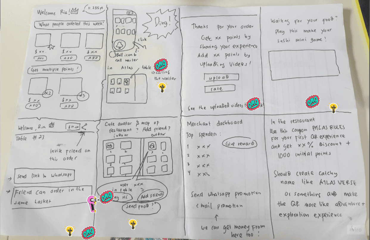
Brainstorming
Crazy 8's and voting were done with the whole team, considering the HMWs and the competitor research. Everyone got their hands dirty sketching.
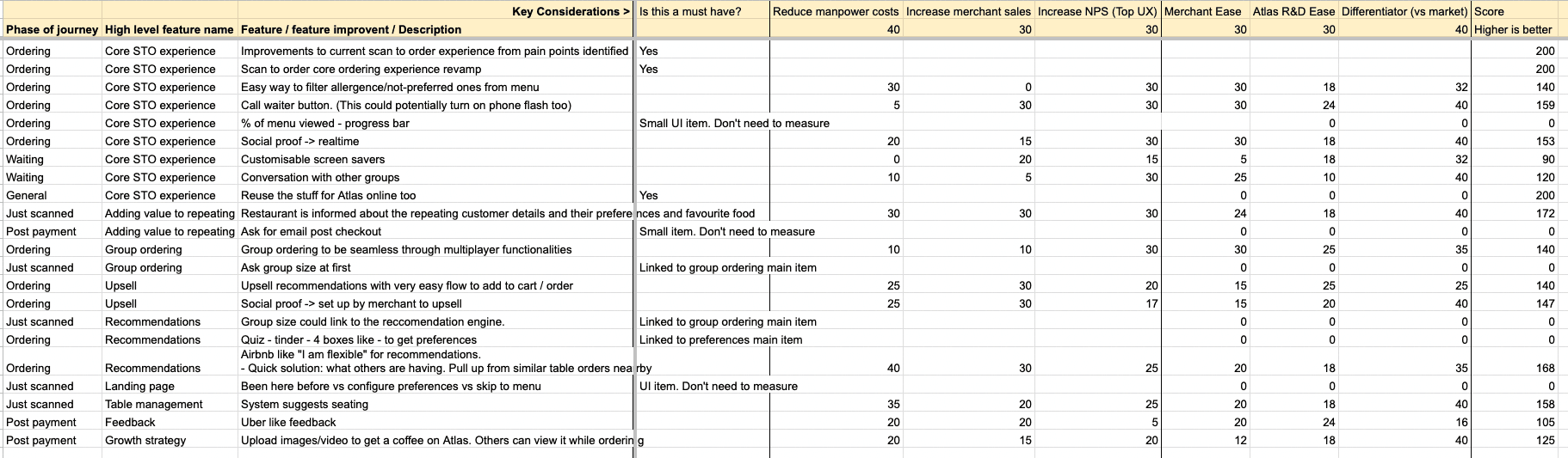
Impact × Effort analysis
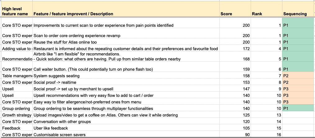
I ported the ideas from the brainstorming session into a Google Sheet and did an impact/effort analysis towards the following values:
- Reduce manpower costs
- Increase merchant sales
- Increase NPS
- Differentiator score
Ranked them in order and decided Phase 1 (P1), Phase 2 (P2), Phase 3 (P3) sequence after discussing with the tech lead / CTO an order that makes sense for the architecture of the system. For Phase 1, we picked up and continued to UI design and usability testing.
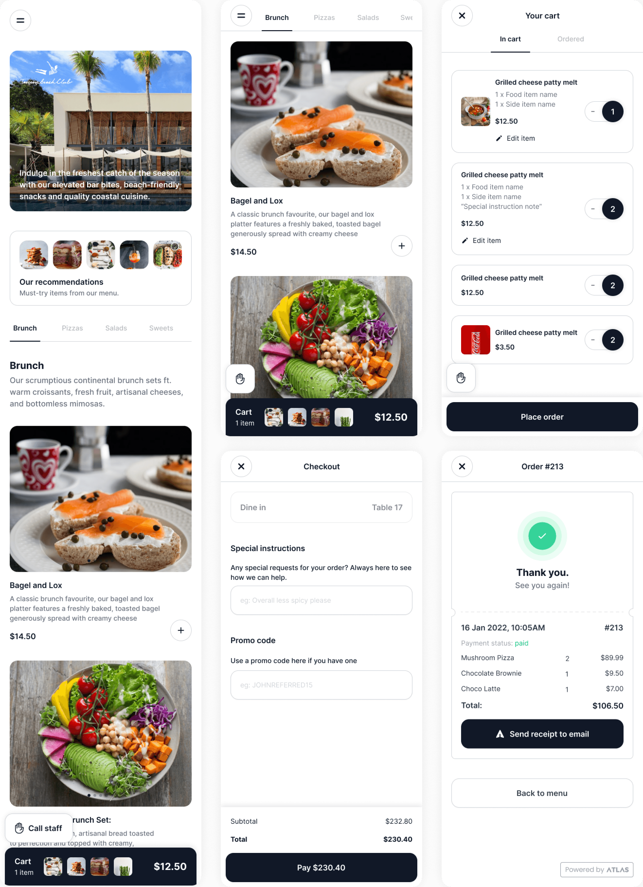
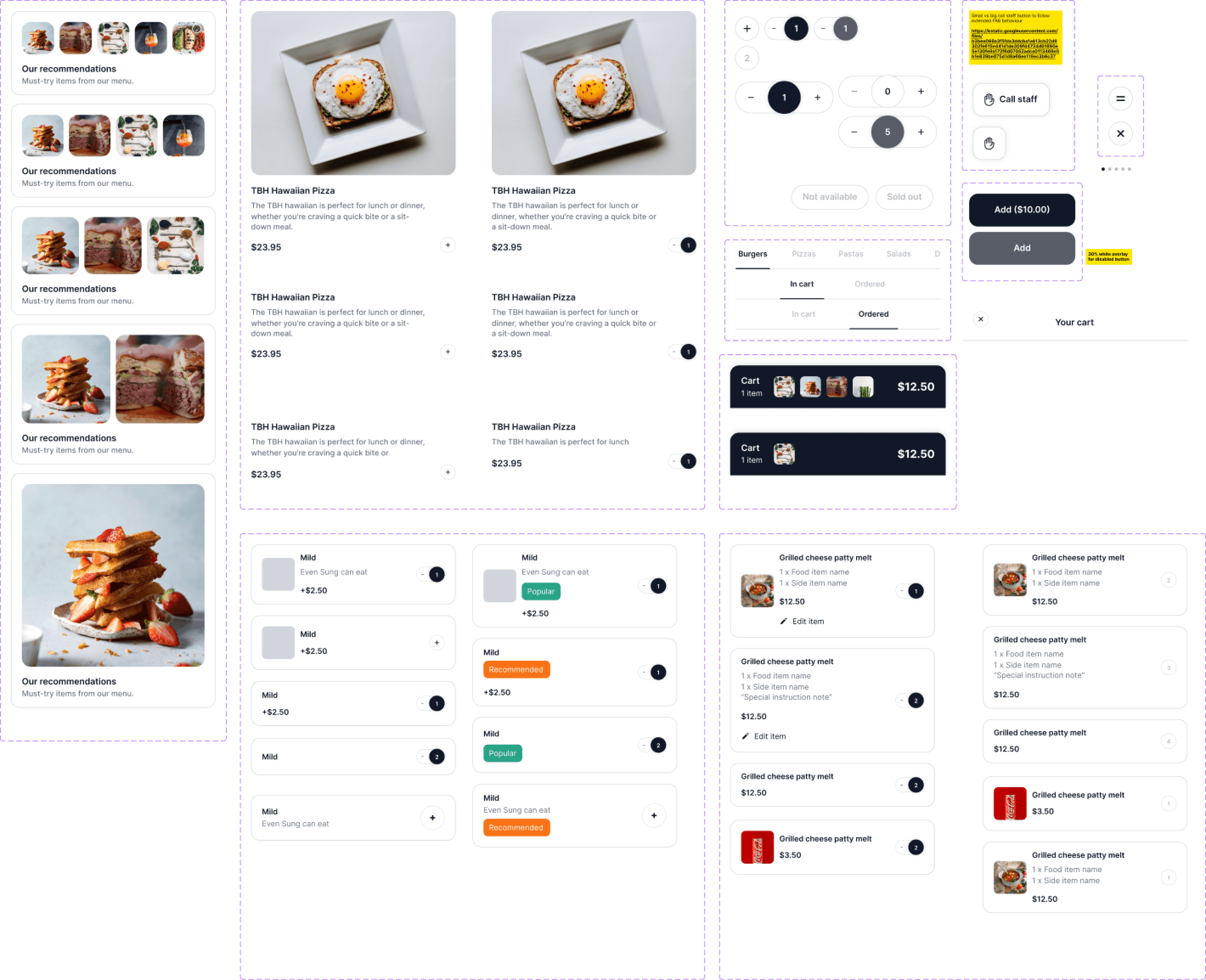
First crafting pass
I took the pen and went to Figma (solo designer — me). Crafted the UI, frequently tested within the team and a few friends — as we all are diners ourselves too. Many variations of UI were drawn and tested.
The first one (the yucky one 😅) looked decent. But it didn't pass a few criteria:
- Some buttons were small — feedback we already received from our online ordering system
- Qualitatively, it did not feel good enough. It did not stand out vs competitors. Did not have a signature on its own.
So I went back and had some focus time to rebuild it.
Setting up the foundation
It's always good to have a design system for fresh projects. I've learned that later down the road, it's real tough to squeeze in and change component designs. So I decided to spend some time as early as possible to set up a design system and align it with the engineers.
The success of the system came from:
- Full-size images for products — from my interviews I understood people care about pictures as much or more than descriptions when ordering food
- Bigger buttons, clearer CTAs to avoid the small-target issue from iteration 1
- Signature identity — a visual system that felt premium and differentiated
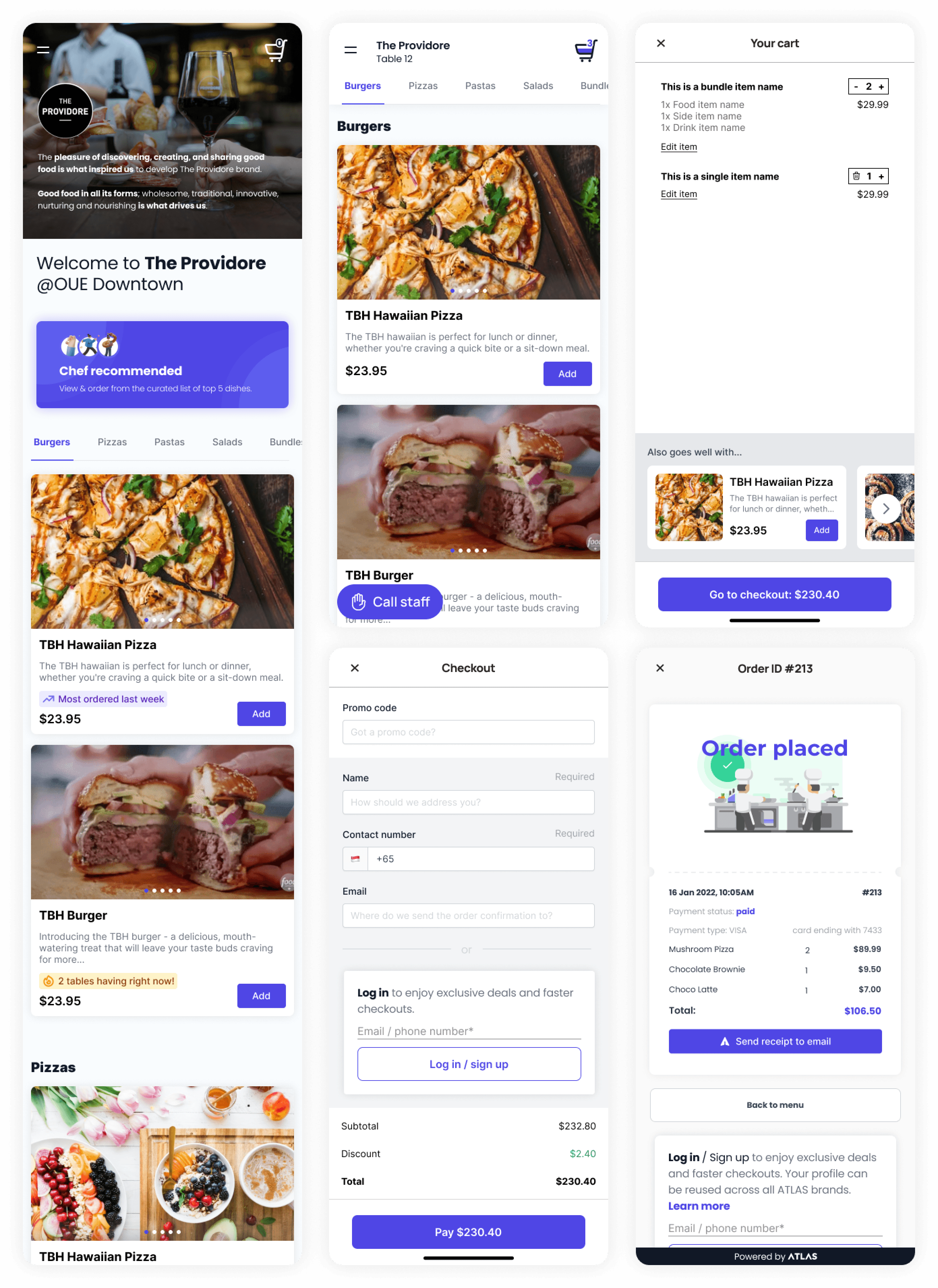
UI iteration 2 (final)
Yes! And there it was — much neater, accessible, and differentiated thanks to the benefits from the design system above. Now it was time for the moment of truth 🙏 — to take all the efforts of the workshops, alignment, design sprint, UI design, and testing to real diners.
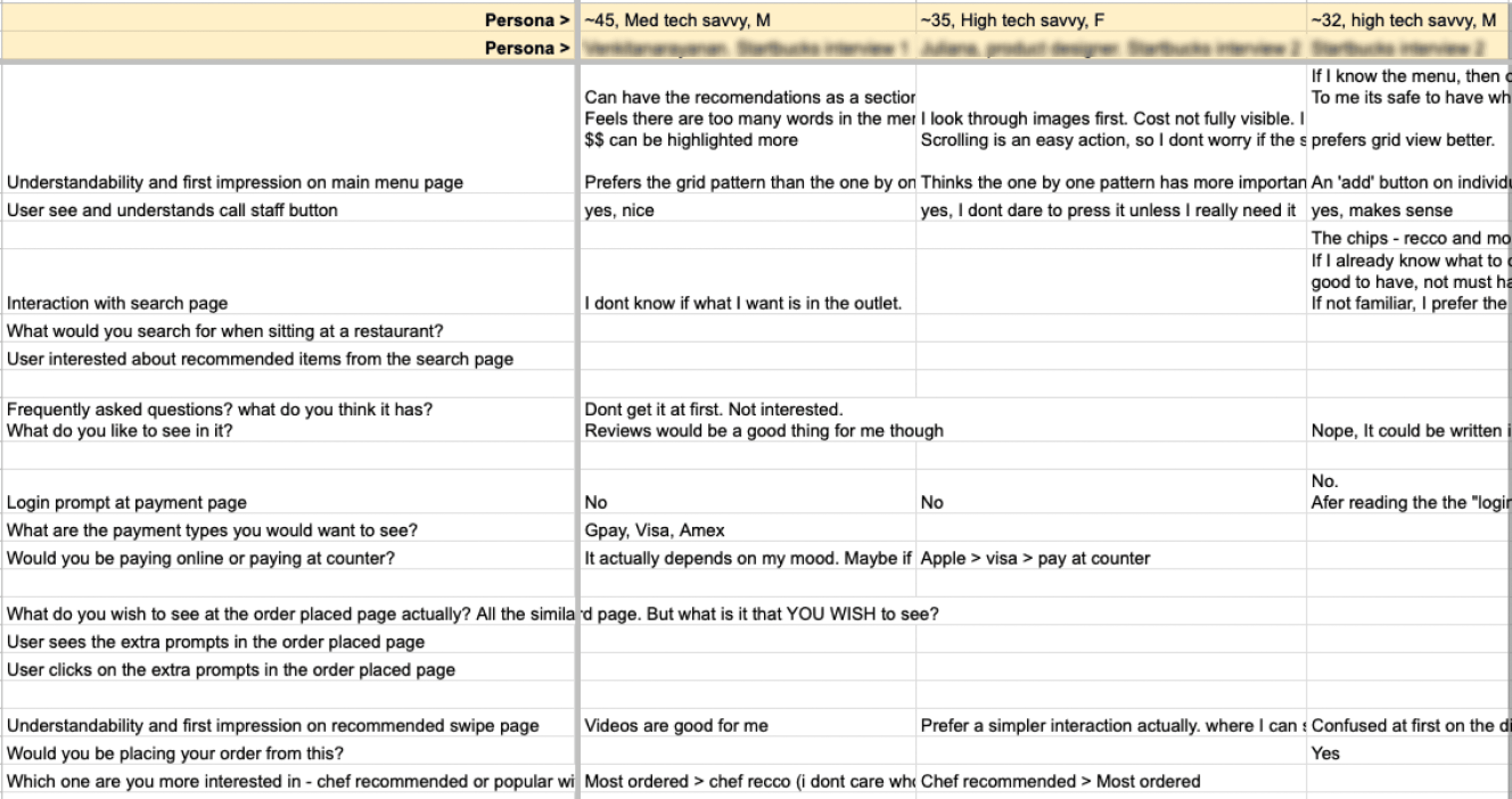
Usability testing
To validate the design, I conducted usability testing aimed at gauging the understandability of the product flow and UI, and analysing potential task-success risks. For this project it was easier than others to find users — they could be any diners in Singapore. I went down to various restaurants to interview diners.
The results were not bad. Generally got people's buy-in that they would be using the niche features like recommendations, call staff, etc. There were a few improvements to make at the login prompt pages in the checkout flow, which were fixed and retested.
Wearing the PM hat
As the project entered the final stages, I donned the hat of a product manager. Responsibilities included obtaining buy-ins from existing merchants to ensure adoption of the new product once launched. Received buy-ins (WTP — willingness to pay) from 3 merchants in 2 days from the demos/pitches I conducted on the Figma prototypes.
I set deadlines for the engineering team, effectively sequencing the product into three phases. To track progress and maintain communication, I managed Linear tasks (JIRA alternative) and organised weekly kickoff meetings.
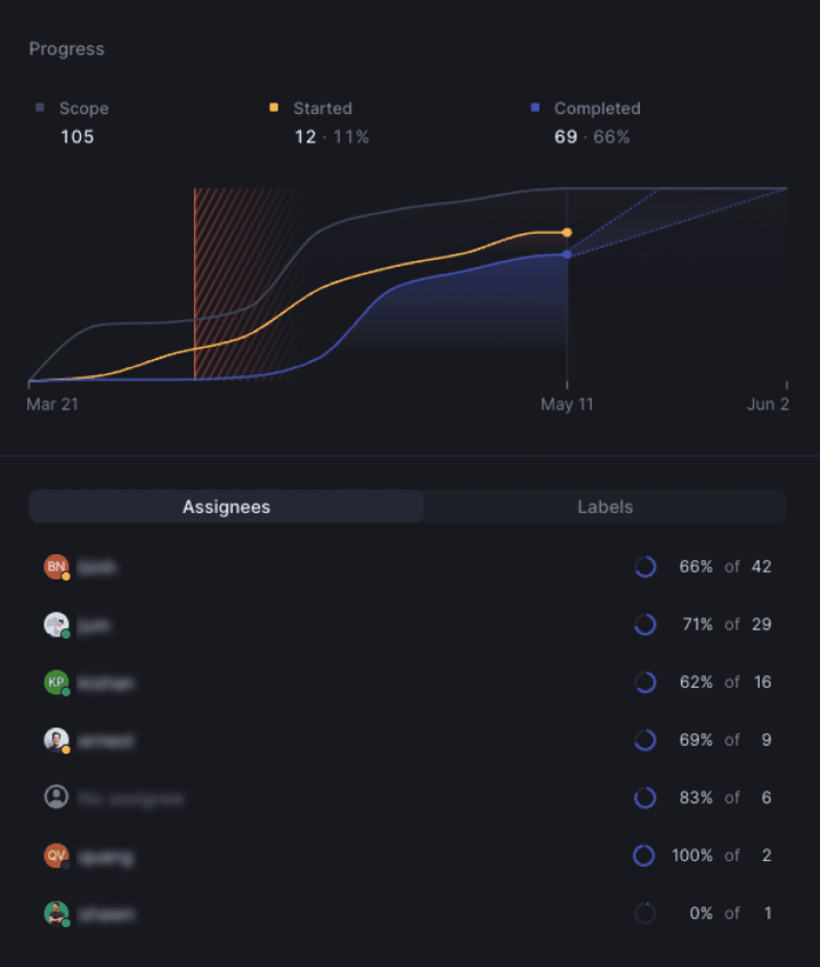
Results at 3 weeks
The product launched for selected merchants on 17 April 2023. As of 11 May 2023 — just 3 weeks in — here's where the numbers landed:
Merchants are happy to pay for this feature when priced above market rate — validating the willingness-to-pay assumption from the kick-off.
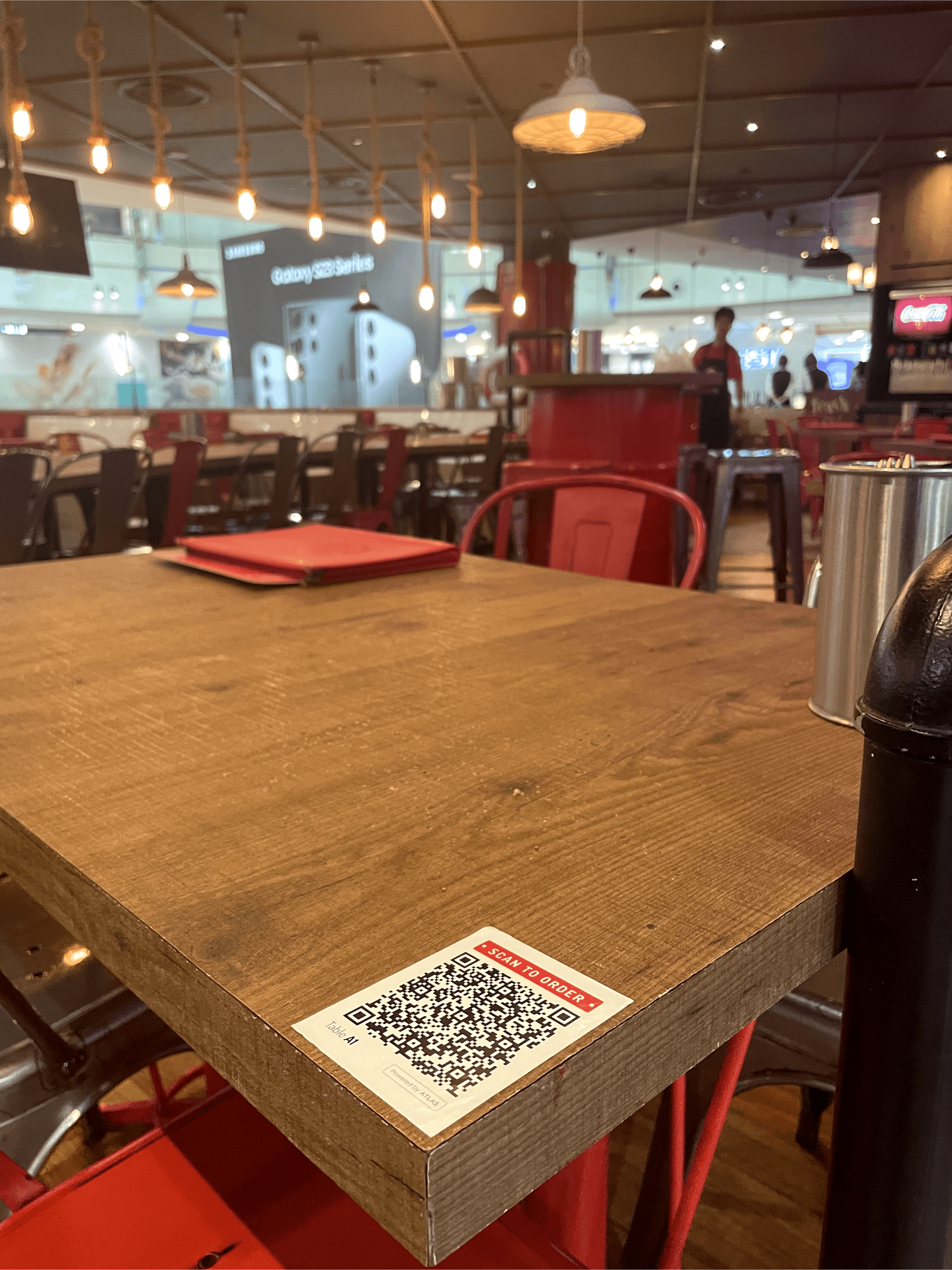
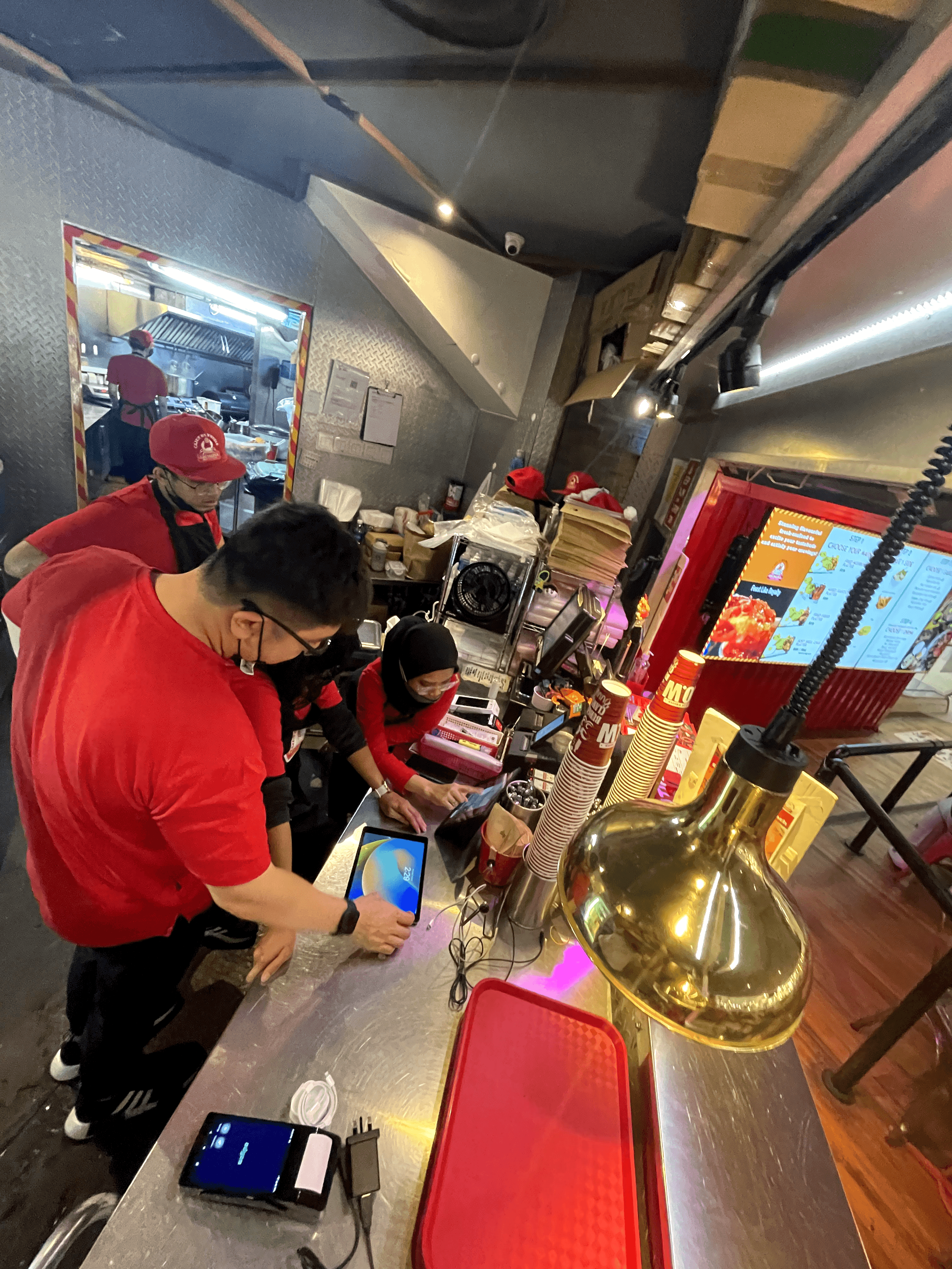
In the wild
Scan-to-Order QR codes at Cajun on Wheels tables 🥹. Onboarding and training the outlet staff.